![]()
Python Foundations, Session 6: Visualization
Instructor: Wesley Beckner
Contact: wesleybeckner@gmail.com
Recording: Video (40 min)
In this session we'll be discussing visualization strategies. And, more specifically, how we can manipulate our pandas dataframes to give us the visualizations we desire. Before we get there, however, we're going to start by introducing a python module called Matplotlib.
6.1 Visualization with Matplotlib
Lets start by importing our matplotlib module.
Pyplot is a module of Matplotlib that provides functions to add plot elements like text, lines, and images. Typically we import this module like so
import matplotlib.pyplot as plt
where plt is shorthand for the matplotlib.pyplot library
import matplotlib.pyplot as plt
6.1.1 The Basics
Matplotlib is strongly object oriented and its principal objects are the figure and the axes. But before we get into that I want us to explore the most basic use case. In this basic use case, we don't declare the figure and axes objects explicitly, but rather work directly in the pyplot namespace. I'l demonstrate to show what I mean here.
I'm going to create a list of x and y values and plot them with pyplot
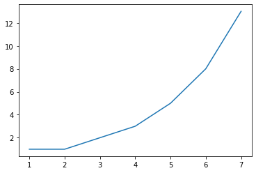
x = [1,2,3,4,5,6,7]
y = [1,1,2,3,5,8,13]
plt.plot(x,y)
x = [1,2,3,4,5,6,7]
y = [1,1,2,3,5,8,13]
plt.plot(x, y)
[<matplotlib.lines.Line2D at 0x22a7cd340d0>]
🙋 Question 1
What do we think about the out-of-the-box formatting of
pyplot? What are some things we can do to make it better? Could we make it bigger? Perhaps different dimensions? Does anyone recognize that default line color?
Before we make any changes, let's become acquianted with the more appropriate way to work in matplotlib.pyplot. In this formality, we explicitly create our figure and axes objects.
You can think of the figure as a canvas, where you specify dimensions and possibly unifying attributes of its contents, like, background color, border, etc. You use the canvas, the figure, to containerize your other objects, primarily your axes, and to save its contents with savefig.
You can think of an axes as the actual graphs or plots themselves. And when we declare these objects, we have access to all the methods of matplotlib.pyplot (e.g. .plot, .scatter, .hist etc.) You can place many of these axes into the figure container in a variety of ways.
The last component of a pyplot figure are the axis, the graphical axis we typically think of.
plt.subplots returns a figure and axes object(s) together:
### We can create the figure (fig) and axes (ax) in a single line
fig, ax = plt.subplots(1, 1, figsize=(8,8))
and we'll go ahead and adjust the figure size with the parameter figsize and set it equal to a tuple containing the x and y dimensions of the figure in inches.
# We can create the figure (fig) and axes (ax) in a single line
fig, ax = plt.subplots(1, 1, figsize=(10,5))
To recap, by convention we typically separate our plots into three components: a Figure, its Axes, and their Axis:
- Figure: It is a whole
figurewhich may contain one or more than oneaxes(plots). You can think of afigureas a canvas which contains plots. - Axes: It is what we generally think of as a plot. A
figurecan contain manyaxes. It contains two or three (in the case of 3D)axisobjects. Eachaxeshas a title, an x-label and a y-label. - Axis: They are the traditional
axiswe think of in a graph and take care of generating the graph limits.
Example:
fig, ax = plt.subplots(1, 1, figsize=(8,8))is creating the figure (fig) and axes (ax) explicitly, and depending on whether we create 2D or 3D plots, the axes will contain 2-3axis.
🏋️ Exercise 1: Adjust Figure Size
- create a
figureandaxesusingplt.subplots(). adjust the figure size to be 6 inches (width) by 3 inches (height). Plot the values of the fibonacci sequence we defined earlier - (Bonus) Repeat, this time inverting the y-values using list splicing
- (Bonus) Explore other
plt.plot()attributes using the built in Colab tooltip
Plotting building blocks for Exercise 1:
* plt.subplots()
* ax.plot()
* slicing [::]
x = [1,2,3,4,5,6,7]
y = [1,1,2,3,5,8,13]
# Cell for Exercise 1
x = [1,2,3,4,5,6,7]
y = [1,1,2,3,5,8,13]
6.1.2 Manipulating Plot Attributes
We can manipulate many parameters of a figure's axes: marker, linestyle, and color, to name a few. Each of these parameters takes string values.
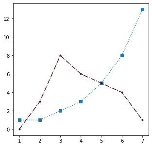
fig, ax = plt.subplots(1,1, figsize=(5,5))
ax.plot([1,2,3,4,5,6,7],[1,1,2,3,5,8,13], marker='^', linestyle='--',
         color='tab:blue')
ax.plot([1,2,3,4,5,6,7],[0,3,8,6,5,4,1], marker='.', linestyle='-.',
         color='#59A41F')
ax.set_title('My Random Values')
ax.set_xlabel('Order in Sequence')
ax.set_ylabel('Value')
List of marker styles
{'': 'nothing',
 ' ': 'nothing',
 '*': 'star',
 '+': 'plus',
 ',': 'pixel',
 '.': 'point',
 0: 'tickleft',
 '1': 'tri_down',
 1: 'tickright',
 10: 'caretupbase',
 11: 'caretdownbase',
 '2': 'tri_up',
 2: 'tickup',
 '3': 'tri_left',
 3: 'tickdown',
 '4': 'tri_right',
 4: 'caretleft',
 5: 'caretright',
 6: 'caretup',
 7: 'caretdown',
 '8': 'octagon',
 8: 'caretleftbase',
 9: 'caretrightbase',
 '<': 'triangle_left',
 '>': 'triangle_right',
 'D': 'diamond',
 'H': 'hexagon2',
 'None': 'nothing',
 None: 'nothing',
 'P': 'plus_filled',
 'X': 'x_filled',
 '^': 'triangle_up',
 '_': 'hline',
 'd': 'thin_diamond',
 'h': 'hexagon1',
 'o': 'circle',
 'p': 'pentagon',
 's': 'square',
 'v': 'triangle_down',
 'x': 'x',
 '|': 'vline'}
 ```

List of line styles
{'': '_draw_nothing', ' ': '_draw_nothing', '-': '_draw_solid', '--': '_draw_dashed', '-.': '_draw_dash_dot', ':': '_draw_dotted', 'None': '_draw_nothing'} ```
List of base colors
{'b': (0, 0, 1),
 'c': (0, 0.75, 0.75),
 'g': (0, 0.5, 0),
 'k': (0, 0, 0),
 'm': (0.75, 0, 0.75),
 'r': (1, 0, 0),
 'w': (1, 1, 1),
 'y': (0.75, 0.75, 0)}
list access
import matplotlib as mp
mp.markers.MarkerStyle.markers
mp.lines.lineStyles
mp.colors.BASE_COLORS
Taking these long lists of available parameters, I'm going to play around with a few and see how they appear in our plot.
import matplotlib as mp
mp.markers.MarkerStyle.markers
# mp.lines.lineStyles
# mp.colors.BASE_COLORS
{'': 'nothing',
 ' ': 'nothing',
 '*': 'star',
 '+': 'plus',
 ',': 'pixel',
 '.': 'point',
 0: 'tickleft',
 '1': 'tri_down',
 1: 'tickright',
 10: 'caretupbase',
 11: 'caretdownbase',
 '2': 'tri_up',
 2: 'tickup',
 '3': 'tri_left',
 3: 'tickdown',
 '4': 'tri_right',
 4: 'caretleft',
 5: 'caretright',
 6: 'caretup',
 7: 'caretdown',
 '8': 'octagon',
 8: 'caretleftbase',
 9: 'caretrightbase',
 '<': 'triangle_left',
 '>': 'triangle_right',
 'D': 'diamond',
 'H': 'hexagon2',
 'None': 'nothing',
 None: 'nothing',
 'P': 'plus_filled',
 'X': 'x_filled',
 '^': 'triangle_up',
 '_': 'hline',
 'd': 'thin_diamond',
 'h': 'hexagon1',
 'o': 'circle',
 'p': 'pentagon',
 's': 'square',
 'v': 'triangle_down',
 'x': 'x',
 '|': 'vline'}
Let's see some of these changes in action
fig, ax = plt.subplots(1,1, figsize=(5,5))
ax.plot([1,2,3,4,5,6,7],[1,1,2,3,5,8,13],
        marker='s',
        linestyle=':',
        color='tab:blue')
ax.plot([1,2,3,4,5,6,7],[0,3,8,6,5,4,1], marker='.',
        linestyle='-.', color='#3E1515')
[<matplotlib.lines.Line2D at 0x22a7ce86cd0>]
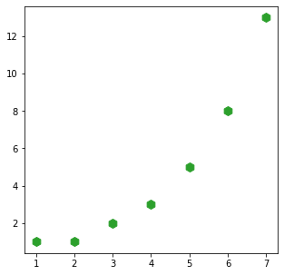
If we want to make a scatter plot without any lines at all, we set the linestyle to an empty string
fig, ax = plt.subplots(1,1, figsize=(5,5))
plt.plot([1,2,3,4,5,6,7],[1,1,2,3,5,8,13], marker='*', linestyle='', color='tab:green')
fig, ax = plt.subplots(1,1, figsize=(5,5))
plt.plot([1,2,3,4,5,6,7],[1,1,2,3,5,8,13], marker='h', linestyle='', ms=10,
         color='tab:green')
[<matplotlib.lines.Line2D at 0x22a7cf02c10>]
You may be wondering where those axis labels are. We can set those as well!
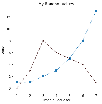
fig, ax = plt.subplots(1,1, figsize=(5,5))
ax.plot([1,2,3,4,5,6,7],[1,1,2,3,5,8,13],
        marker='s',
        linestyle=':',
        color='tab:blue')
ax.plot([1,2,3,4,5,6,7],[0,3,8,6,5,4,1], marker='.',
        linestyle='-.', color='#3E1515')
ax.set_title('My Random Values')
ax.set_xlabel('Order in Sequence')
ax.set_ylabel('Value')
Text(0, 0.5, 'Value')
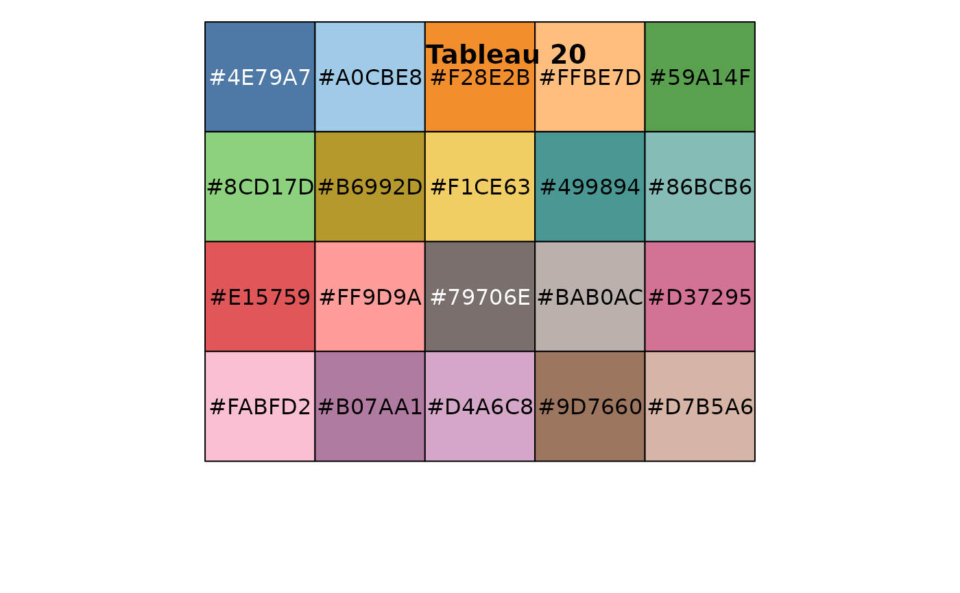
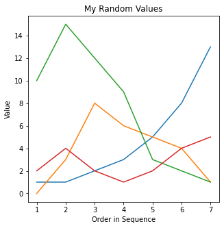
🏋️ Exercise 2: Choose Lines, Colors, and Markers
- Recreate the "My Random Values" plot with a variety of markers, linestyles, and colors.
- (Bonus) Can you set the markers and lines to colors belonging to the Tableau 20? Try it with and without the hex values!
Plotting building blocks for Exercise 2:
* marker=''
* linestyle=''
* color=''
# Cell for Exercise 2

### DO NOT CHANGE BELOW ###
x = [1,2,3,4,5,6,7]
y1 = [1,1,2,3,5,8,13]
y2 = [0,3,8,6,5,4,1]
y3 = [10,15,12,9,3,2,1]
y4 = [2,4,2,1,2,4,5]
fig, ax = plt.subplots(1,1, figsize=(5,5))
ax.set_title('My Random Values')
ax.set_xlabel('Order in Sequence')
ax.set_ylabel('Value')
### END OF DO NOT CHANGE ###

### change these lines w/ marker, linestyle, color attributes
ax.plot(x,y1)
ax.plot(x,y2)
ax.plot(x,y3)
ax.plot(x,y4)
[<matplotlib.lines.Line2D at 0x7fcd316d14d0>]
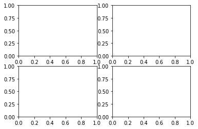
6.1.3 Subplots
Remember that fig, ax = plt.subplots() satement we used earlier? We're now going to use that same approach but this time, the second variable that is returned (what we call ax in the cell bellow) is no longer an axes object! Instead, it is an array of axes objects.
I'm also going to introduce another module, random, to generate some random values
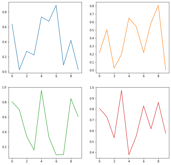
import random
fig, ax = plt.subplots(2, 2, figsize=(10,10))
ax[0,1].plot(range(10), [random.random() for i in range(10)],
             c='tab:orange')
ax[1,0].plot(range(10), [random.random() for i in range(10)],
             c='tab:green')
ax[1,1].plot(range(10), [random.random() for i in range(10)],
             c='tab:red')
ax[0,0].plot(range(10), [random.random() for i in range(10)],
             c='tab:blue')
quick note: In the above cell we use something called list comprehension to quickly populate a list of objects (in this case those objects are floats). We won't dive too deeply into that now, but you can think of list comprehension as a more concise way of writing a for() loop. In future cases where list comprehension appears in this notebook I will include code snipets of the corresponding for loop.
import random

# this list comprehension
print([random.random() for i in range(10)])

# produces the same output as this for loop
ls = []
for i in range(10):
  ls.append(random.random())
print(ls)
import random
random.seed(42)

# this list comprehension
print([random.random() for i in range(10)])

random.seed(42)
# produces the same output as this for loop
ls = []
for i in range(10):
  ls.append(random.random())
print(ls)
[0.6394267984578837, 0.025010755222666936, 0.27502931836911926, 0.22321073814882275, 0.7364712141640124, 0.6766994874229113, 0.8921795677048454, 0.08693883262941615, 0.4219218196852704, 0.029797219438070344]
[0.6394267984578837, 0.025010755222666936, 0.27502931836911926, 0.22321073814882275, 0.7364712141640124, 0.6766994874229113, 0.8921795677048454, 0.08693883262941615, 0.4219218196852704, 0.029797219438070344]
The second thing we'll need to talk about is the grid of the ax object
fig, ax = plt.subplots(2,2)
we can investigate its shape:
ax.shape
(2, 2)
as well as the contents contained within:
ax
array([[<matplotlib.axes._subplots.AxesSubplot object at 0x7fcd316f9210>,
        <matplotlib.axes._subplots.AxesSubplot object at 0x7fcd316490d0>],
       [<matplotlib.axes._subplots.AxesSubplot object at 0x7fcd315fb710>,
        <matplotlib.axes._subplots.AxesSubplot object at 0x7fcd315b0d50>]],
      dtype=object)
This is exactly like accessing a matrix:
matrix[row,column] = element
we have the pandas equivalent:
df.iloc[0,1] = element
Putting this all together we can create the following:
import random
random.seed(42)
fig, ax = plt.subplots(2, 2, figsize=(10,10))
ax[0,0].plot(range(10), [random.random() for i in range(10)],
             c='tab:blue')
ax[0,1].plot(range(10), [random.random() for i in range(10)],
             c='tab:orange')
ax[1,0].plot(range(10), [random.random() for i in range(10)],
             c='tab:green')
ax[1,1].plot(range(10), [random.random() for i in range(10)],
             c='tab:red')
[<matplotlib.lines.Line2D at 0x22a7daee280>]
🏋️ Exercise 3: Subplots
- Create a 2x1
figurewhere the firstaxesis a plot of the fibonacci sequence up to the 10th sequence value and the secondaxesis a plot of 10 random integers with values between 10 and 20 (exclusive). Use different markers, colors, and lines for each plot. - Since the focus of this tutorial is on visualization, I'll go ahead and provide my own code for generating random integers between 10 and 20 (exclusive). If you have extra time, prove to yourself that this code works!
- (remember docstrings are your friend!)
import random
[round(random.random() * 8) + 11 for i in range(10)]
# Cell for Exercise 3

### DO NOT CHANGE ###

import random

# create the fig, ax objects
fig, ax = plt.subplots(1, 2, figsize=(10, 5))

# generate x, y1, and y2
x = [1, 2, 3, 4, 5, 6, 7, 8, 9, 10]
y1 = [1, 1, 2, 3, 5, 8, 13, 21, 34, 55]
y2 = [round(random.random() * 8) + 11 for i in range(10)]

### END OF DO NOT CHANGE ###

# Note: no skeleton code here is given for the figure, I want you to write this
# code out yourself. Here is pseudo-code to get you started:

# plot the left axes, set the title and axes labels
# title: Fibonacci Sequence; xlabel: x values; ylabel: y values

### YOUR CODE HERE ###

# plot the right axes, set the title and axes labels
# title: My Random Values; xlabel: x values; ylabel: y values

### YOUR CODE HERE ###
6.2 Visualization with Pandas
Now lets discover the power of pandas plots! While the objectives of the exercizes may be to make certain visualizations, throughout our experience we'll be using pandas tricks to create the data splices we need, so in the following is a mix of new plotting stuff, with pandas data selection/splicing stuff.
We're also going to import a new module called seaborn. It is another plotting library based off matplotlib. We're going to use it to pull some stylistic features.
import pandas as pd
import matplotlib.pyplot as plt
import seaborn as sns
from sklearn.datasets import load_boston
import pandas as pd
import matplotlib.pyplot as plt
import seaborn as sns
from ipywidgets import interact
The following few cells should look familiar from last tutorial session, we're going to use some essential pandas methods to get a general sense of what our dataset looks like
There are many ways to construct a dataframe, as an exercise, you might think of otherways to perform that task here.
df = pd.read_csv("https://raw.githubusercontent.com/wesleybeckner/ds_for_engineers/main/data/wine_quality/winequalityN.csv")
df.describe()
# In your subsequent time with pandas you'll discover that there are a host of
# ways to populate a dataframe. In the following, I can create a dataframe
# simply by using read_csv because the data is formated in a way that
# pandas can easily intuit.

df = pd.read_csv("https://raw.githubusercontent.com/wesleybeckner/"\
  "technology_explorers/main/assets/imdb_movies.csv")
# we check the shape of our data to see if its as we expect
df.shape
(85855, 22)
# we check the column names
df.columns
Index(['imdb_title_id', 'title', 'original_title', 'year', 'date_published',
       'genre', 'duration', 'country', 'language', 'director', 'writer',
       'production_company', 'actors', 'description', 'avg_vote', 'votes',
       'budget', 'usa_gross_income', 'worlwide_gross_income', 'metascore',
       'reviews_from_users', 'reviews_from_critics'],
      dtype='object')
Lets start by looking at basic description of our data. This gives us a sense of what visualizations we can employ to begin understanding our dataset.
df.describe()
| duration | avg_vote | votes | metascore | reviews_from_users | reviews_from_critics | |
|---|---|---|---|---|---|---|
| count | 85855.000000 | 85855.000000 | 8.585500e+04 | 13305.000000 | 78258.000000 | 74058.000000 |
| mean | 100.351418 | 5.898656 | 9.493490e+03 | 55.896881 | 46.040826 | 27.479989 |
| std | 22.553848 | 1.234987 | 5.357436e+04 | 17.784874 | 178.511411 | 58.339158 |
| min | 41.000000 | 1.000000 | 9.900000e+01 | 1.000000 | 1.000000 | 1.000000 |
| 25% | 88.000000 | 5.200000 | 2.050000e+02 | 43.000000 | 4.000000 | 3.000000 |
| 50% | 96.000000 | 6.100000 | 4.840000e+02 | 57.000000 | 9.000000 | 8.000000 |
| 75% | 108.000000 | 6.800000 | 1.766500e+03 | 69.000000 | 27.000000 | 23.000000 |
| max | 808.000000 | 9.900000 | 2.278845e+06 | 100.000000 | 10472.000000 | 999.000000 |
df.loc[:, df.dtypes == object].describe()
| imdb_title_id | title | original_title | year | date_published | genre | country | language | director | writer | production_company | actors | description | budget | usa_gross_income | worlwide_gross_income | |
|---|---|---|---|---|---|---|---|---|---|---|---|---|---|---|---|---|
| count | 85855 | 85855 | 85855 | 85855 | 85855 | 85855 | 85791 | 85022 | 85768 | 84283 | 81400 | 85786 | 83740 | 23710 | 15326 | 31016 |
| unique | 85855 | 82094 | 80852 | 168 | 22012 | 1257 | 4907 | 4377 | 34733 | 66859 | 32050 | 85729 | 83611 | 4642 | 14857 | 30414 |
| top | tt0000009 | Anna | Anna | 2017 | 2010 | Drama | USA | English | Jesús Franco | Jing Wong | Metro-Goldwyn-Mayer (MGM) | Nobuyo Ôyama, Noriko Ohara, Michiko Nomura, Ka... | The story of | $ 1000000 | $ 1000000 | $ 8144 |
| freq | 1 | 10 | 10 | 3223 | 113 | 12543 | 28511 | 35939 | 87 | 84 | 1284 | 9 | 15 | 758 | 19 | 15 |
The first thing we notice is that all the data is numerical that we can pull standard statistical information from (mean, std, max, etc.)
What kind of visualizations do you think of with data like this?
I tend to think of scatter, box, and histogram plots for numerical data and bar or sunburst charts for categorical data.
6.2.1 Scatter Plots
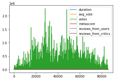
The way to generate a plot in the fewest keystrokes is to simply call the plot() method within the dataframe object
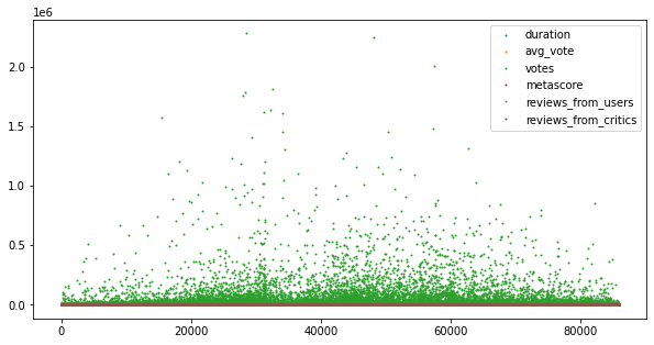
df.plot()
# the simplest plot we can make is the following so let's start here.
# We can generate a figure simply by using the plot() method of our dataframe
# object.

df.plot()
<AxesSubplot:>
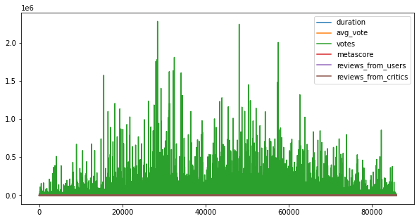
This gives us a raw view of the data, but here I'd like to introduce some standard plotting steps: recall the fig, ax format we used previously.
fig, ax = plt.subplots(1, 1, figsize = (10, 5))
df.plot(ax=ax)
fig, ax = plt.subplots(1, 1, figsize = (10, 5))
df.plot(ax=ax)
<AxesSubplot:>
To make this into a scatter plot, we set the linestyle (or ls) to an empty string, and select a marker type.
fig, ax = plt.subplots(1, 1, figsize = (10, 5))
df.plot(ax=ax, linestyle='', marker='.')
fig, ax = plt.subplots(1, 1, figsize = (10, 5))
df.plot(ax=ax, ls='', marker='.', ms=2)
<AxesSubplot:>
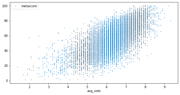
To plot X and Y that are specific columns of our dataframe we specify them in the call to df.plot()
fig, ax = plt.subplots(1, 1, figsize = (10, 5))
df.plot('avg_vote', 'metascore', ax=ax, ls='', marker='.', ms=2)
<AxesSubplot:xlabel='avg_vote'>
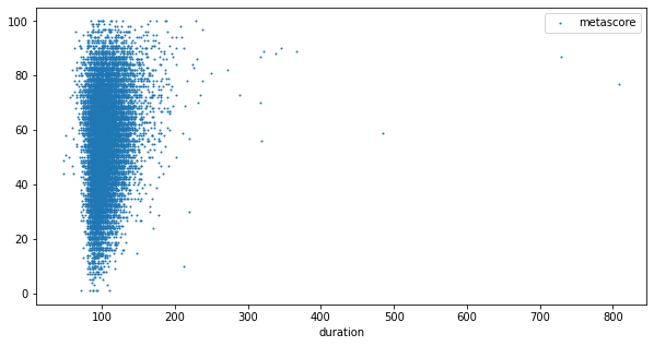
🏋️ Exercise 4: Scatter Plots with Pandas
Make a plot of duration vs metascore
# Cell for Exercise 4
fig, ax = plt.subplots(1, 1, figsize = (10, 5))
# plot the data
<matplotlib.axes._subplots.AxesSubplot at 0x7fcd18498ad0>
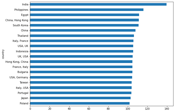
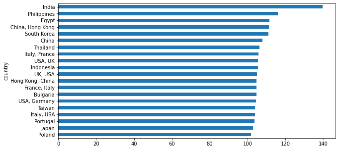
6.2.2 Bar Plots
One of the more common methods of depicting aggregate data is bar plots. We almost always see these kinds of plots used to display and compare between averages, but sometimes between singular data values as well.
fig, ax = plt.subplots(1, 1, figsize=(10,7.5))

df.groupby('country').filter(lambda x: x.shape[0] > 100).\
   groupby('country')['duration'].mean().sort_values()\
   [-20:].plot(kind='barh', ax=ax)
fig, ax = plt.subplots(1, 1, figsize=(10,7.5))

df.groupby('country').filter(lambda x: x.shape[0] > 100).\
   groupby('country')['duration'].mean().sort_values(na_position='first')\
   [-20:].plot(kind='barh', ax=ax)
<AxesSubplot:ylabel='country'>
6.3 🍒 Enrichment: Other Plot Types
6.3.1 Box Plots
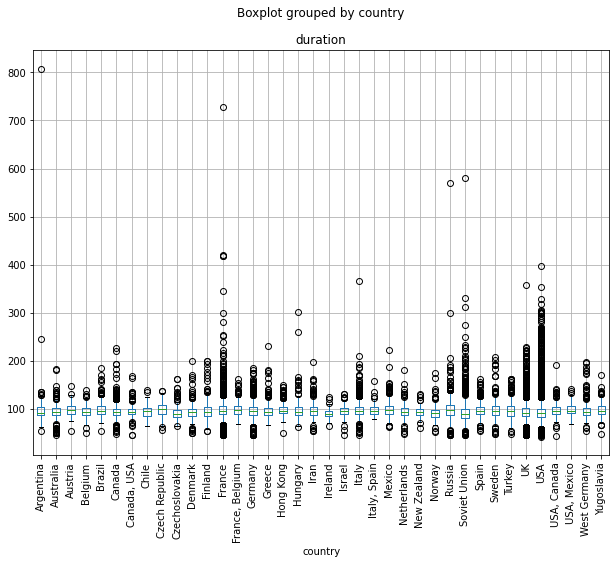
Maybe we thought it was usefull to see the feature data in the scatter plots ( we can visually scan for correlations between feature sets, check outliers, etc.) but perhaps more instructive, is a boxplot. A box plot or boxplot is a statistical method for graphically depicting aggregate data through their quartiles. It will be useful to inspect the boxplot API to see the default behavior for representing the quartiles and outliers.
fig, ax = plt.subplots(1, 1, figsize = (10, 5))
df.plot(kind='box', ax=ax)
fig, ax = plt.subplots(1, 1, figsize=(10,7.5))
df.groupby('country').filter((lambda x: (x.shape[0] > 100) & # filter by number of datapoints
                              (x['duration'].mean() < 100)) # filter by average movie time
                         ).boxplot(by='country', column='duration', rot=90, ax=ax)
/usr/local/lib/python3.7/dist-packages/numpy/core/_asarray.py:83: VisibleDeprecationWarning: Creating an ndarray from ragged nested sequences (which is a list-or-tuple of lists-or-tuples-or ndarrays with different lengths or shapes) is deprecated. If you meant to do this, you must specify 'dtype=object' when creating the ndarray
  return array(a, dtype, copy=False, order=order)


<matplotlib.axes._subplots.AxesSubplot at 0x7fcd04c5d9d0>
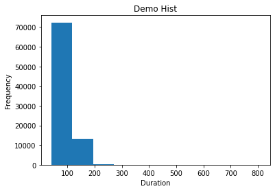
6.3.2 Histograms
What are some other kinds of plots we can make? A good one to be aware of is the histogram.
plt.title('Demo Hist')
plt.xlabel('Duration')
plt.ylabel('Frequency')
plt.hist(df['duration'])
plt.title('Demo Hist')
plt.xlabel('Duration')
plt.ylabel('Frequency')
plt.hist(df['duration'])
(array([7.2368e+04, 1.3197e+04, 2.2800e+02, 4.0000e+01, 1.1000e+01,
        4.0000e+00, 4.0000e+00, 1.0000e+00, 1.0000e+00, 1.0000e+00]),
 array([ 41. , 117.7, 194.4, 271.1, 347.8, 424.5, 501.2, 577.9, 654.6,
        731.3, 808. ]),
 <a list of 10 Patch objects>)
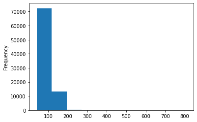
df['duration'].plot(kind='hist')
<matplotlib.axes._subplots.AxesSubplot at 0x7fcd0471d210>
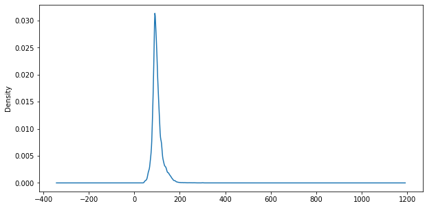
6.3.3 Kernel Density Estimates
Another useful plot type for data analysis is the kernel density estimate. You can think of this plot as exactly like a histogram, except instead of creating bins in which to accrue datapoints, you deposit a gaussian distribution around every datapoint in your dataset. By this mechanism, you avoid creating bias in your data summary as you otherwise would be when predifining bin sizes and locations in a histogram.
fig, ax = plt.subplots(1, 1, figsize = (10, 5))
df['duration'].plot(kind='kde', ax=ax)
<matplotlib.axes._subplots.AxesSubplot at 0x7fcd046ac7d0>
🍒🍒 6.3.3.1 Double Enrichment: Skew and Tailedness
While we're on the topic of KDEs/histograms and other statistical plots, this is a convenient time to talk about skew and tailedness or, otherwise known as kurtosis
df.skew()indicates the skewdness of the datadf.kurtosis()indicates the tailedness of the data
# from scipy.stats import skewnorm
from ipywidgets import FloatSlider
slider = FloatSlider(
    value=0.5,
    min=0.5,
    max=5,
    step=0.5,
    description='Shape:',
    disabled=False,
    continuous_update=False,
    orientation='horizontal',
    readout=True,
    readout_format='.1f'
)
import numpy as np
def inspect_kurt_skew(a=slider):
  # theres another hyperparameter, lambda for the center
  # of weibull. the shape parameter is sometimes called
  # a, or k
  fig, ax = plt.subplots(1, 1, figsize=(5,5))
  s = np.random.weibull(a, 1000)
  statdf = pd.DataFrame(s)
  statdf[0].plot(kind='kde', ax=ax)
  print("skew: {:.2f}".format(statdf[0].skew()))
  print("kurtosis: {:.2f}".format(statdf[0].kurt()))
interact(inspect_kurt_skew)
interactive(children=(FloatSlider(value=0.5, continuous_update=False, description='Shape:', max=5.0, min=0.5, …


<function __main__.inspect_kurt_skew>
6.3.4 Correlation Plots
Often, we'll want to quantify the strength of a relationship between input variables. We can do this by calculating correlations.
We won't go into great detail here about how Pearson's correlation is calculated, but the StatQuest videos on this subject are here for reference (and are really good... if you can stomach Starmer's humor)
The main takeaway is that pearson's correlation ranges from -1 to 1 and indicates how positively or negatively correlated the variables in question are. For our purposes, this can give insight into what variables will be important in our machine learning model.
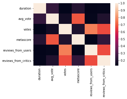
We can get the pearson's correlation between all the input features using the dataframe.corr() method.

Fig: pearson's correlation value and corresponding scatter plot of feature-x and feature-y
df.corr()
| duration | avg_vote | votes | metascore | reviews_from_users | reviews_from_critics | |
|---|---|---|---|---|---|---|
| duration | 1.000000 | 0.242432 | 0.125618 | 0.210531 | 0.130836 | 0.135465 |
| avg_vote | 0.242432 | 1.000000 | 0.166972 | 0.691338 | 0.138185 | 0.200526 |
| votes | 0.125618 | 0.166972 | 1.000000 | 0.194730 | 0.766237 | 0.671635 |
| metascore | 0.210531 | 0.691338 | 0.194730 | 1.000000 | 0.126131 | 0.236107 |
| reviews_from_users | 0.130836 | 0.138185 | 0.766237 | 0.126131 | 1.000000 | 0.671634 |
| reviews_from_critics | 0.135465 | 0.200526 | 0.671635 | 0.236107 | 0.671634 | 1.000000 |
So we have this raw table of pearsons correlations between each of our input features, how do we and how should we turn this into a plot?
Typically we'd use a heat map on a feature vs feature grid to view this kind of data. In the following I'm going to use some numpy methods you may not have seen before. Links to the documentation for these methods are at the end of the notebook.
import numpy as np
fig, ax = plt.subplots(1, 1, figsize = (10,10))

# create a mask to white-out the upper triangle
mask = np.triu(np.ones_like(df.corr(), dtype=bool))

# we'll want a divergent colormap for this so our eye
# is not attracted to the values close to 0
cmap = sns.diverging_palette(230, 20, as_cmap=True)

sns.heatmap(df.corr(), mask=mask, cmap=cmap, ax=ax)
sns.heatmap(df.corr())
<matplotlib.axes._subplots.AxesSubplot at 0x7fcd023a6a10>
import numpy as np
fig, ax = plt.subplots(1, 1, figsize = (10,10))

# create a mask to white-out the upper triangle
mask = np.triu(np.ones_like(df.corr(), dtype=bool))

# we'll want a divergent colormap for this so our eye
# is not attracted to the values close to 0
cmap = sns.diverging_palette(230, 20, as_cmap=True)

sns.heatmap(df.corr(), mask=mask, cmap=cmap, ax=ax)
<matplotlib.axes._subplots.AxesSubplot at 0x7fcd0239fc90>
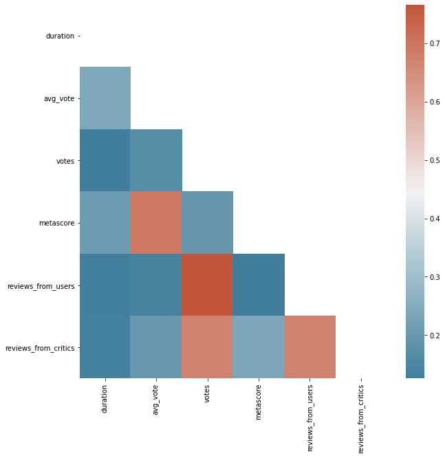
What do we notice?
looks like reviews and votes are all pretty correlated. Surprising?
6.4 Visualization with IpyWidgets
6.4.1 Interact
Here we're going to introduce a very basic use case of IPython's widgets using interact. The interact method (ipywidgets.interact) automatically creates user interface (UI) controls for exploring code and data interactively. It is the easiest way to get started using IPython’s widgets.
def my_plot(col=df.select_dtypes('number').columns):
  fig, ax = plt.subplots(1,1,figsize=(10,5))
  df.groupby('country').filter(lambda x: x.shape[0] > 100).\
   groupby('country')[col].mean().sort_values(na_position='first')\
   [-20:].plot(kind='barh', ax=ax)
After defining our function that returns our plot, and defining input parameters for the fields we would like to interact with, we call our function with interact
interact(my_plot)
interact(my_plot)
interactive(children=(Dropdown(description='col', options=('duration', 'avg_vote', 'votes', 'metascore', 'revi…


<function __main__.my_plot(col=Index(['duration', 'avg_vote', 'votes', 'metascore', 'reviews_from_users',
       'reviews_from_critics'],
      dtype='object'))>
Let's break this down. Normally, I would just set my y-variable to a value, so that when I call my function, my figure is generated with the corresponding data field:
def my_plot(col='duration'):
  fig, ax = plt.subplots(1,1,figsize=(10,5))
  df.groupby('country').filter(lambda x: x.shape[0] > 100).\
   groupby('country')[col].mean().sort_values(na_position='first')\
   [-20:].plot(kind='barh', ax=ax)

my_plot()
Instead, we want to give interact() a list of values for the user to select from, this is the difference between a regular function, and one we might feed into interact.
y = ['duration',
 'avg_vote',
 'votes',
 'metascore',
 'reviews_from_users',
 'reviews_from_critics']
list(df.select_dtypes('number').columns)
['duration',
 'avg_vote',
 'votes',
 'metascore',
 'reviews_from_users',
 'reviews_from_critics']
🏋️ Exercise 5: IpyWidgets and Figures in Functions
In the previous section we created a single dropdown menu to select our y variable for our plot. Here, we would like to do the same thing, but this time for directors rather than country. Filter your dataframe for only directors that have 5 or more datapoints and only return the top 10 highest average values (there should be 10 directors in the final plot).
When you build the interactive plot, grouby director this time instead of country.
# Code block for Exercise 5
def my_plot(col=df.select_dtypes('number').columns):
  fig, ax = plt.subplots(1,1,figsize=(10,5))
  df.groupby('director').filter(lambda x: x.shape[0] > 5).\
   groupby('director')[col].mean().sort_values(na_position='first')\
   [-10:].plot(kind='barh', ax=ax)
interact(my_plot)
interactive(children=(Dropdown(description='col', options=('duration', 'avg_vote', 'votes', 'metascore', 'revi…


<function __main__.my_plot(col=Index(['duration', 'avg_vote', 'votes', 'metascore', 'reviews_from_users',
       'reviews_from_critics'],
      dtype='object'))>
6.5 🍒 Enrichment: Other Plot Types (Continued)
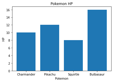
6.5.1 Bar Plots (Advanced)
Similar to how we created bar plots with pandas, we can use matplotlib to make barplots
pokemon = ['Charmander', 'Pikachu', 'Squirtle', 'Bulbasaur']
hp = [10, 12, 8, 16]

plt.bar(pokemon, hp, color='tab:blue')
plt.title('Pokemon HP')
plt.xlabel('Pokemon')
plt.ylabel('HP')
pokemon = ['Charmander', 'Pikachu', 'Squirtle', 'Bulbasaur']
hp = [10, 12, 8, 16]

plt.bar(pokemon, hp, color='tab:blue')
plt.title('Pokemon HP')
plt.xlabel('Pokemon')
plt.ylabel('HP')
Text(0, 0.5, 'HP')
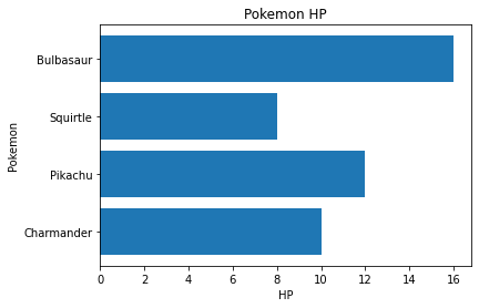
Doing the same but with horizontally oriented bars
pokemon = ['Charmander', 'Pikachu', 'Squirtle', 'Bulbasaur']
hp = [10, 12, 8, 16]

plt.barh(pokemon, hp, color='tab:blue')
plt.title('Pokemon HP')
plt.ylabel('Pokemon')
plt.xlabel('HP')
pokemon = ['Charmander', 'Pikachu', 'Squirtle', 'Bulbasaur']
hp = [10, 12, 8, 16]

plt.barh(pokemon, hp, color='tab:blue')
plt.title('Pokemon HP')
plt.ylabel('Pokemon')
plt.xlabel('HP')
Text(0.5, 0, 'HP')
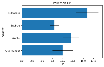
We can also add error bars
pokemon = ['Charmander', 'Pikachu', 'Squirtle', 'Bulbasaur']
hp = [10, 12, 8, 16]
variance = [i * random.random()*.25 for i in hp]

plt.barh(pokemon, hp, xerr=variance, color='tab:blue')
plt.title('Pokemon HP')
plt.ylabel('Pokemon')
plt.xlabel('HP')
for loop version of list comprehension
hp = [10, 12, 8, 16]
variance = []
for i in hp:
  variance.append(i * random.random()*.25)
print(variance)
pokemon = ['Charmander', 'Pikachu', 'Squirtle', 'Bulbasaur']
hp = [10, 12, 8, 16]
variance = [i * random.random()*.25 for i in hp]

plt.barh(pokemon, hp, xerr=variance, color='tab:blue')
plt.title('Pokemon HP')
plt.ylabel('Pokemon')
plt.xlabel('HP')
Text(0.5, 0, 'HP')
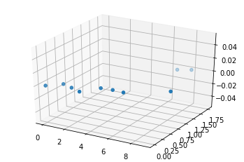
6.5.2 3D Plots
You can also create 3D plots in matplotlib using ax.scatter3D
ax = plt.axes(projection='3d')
ax.scatter3D(range(10),[i*random.random()*.25 for i in range(10)])
for loop version of list comprehension:
ls = []
for i in range(10):
  ls.append(i*random.random()*.25)
print(ls)
ax = plt.axes(projection='3d')
ax.scatter3D(range(10),[i*random.random()*.25 for i in range(10)])
<mpl_toolkits.mplot3d.art3d.Path3DCollection at 0x7fdf86d241d0>
6.5.3 Visualization with Plotly
Another great plotting library, that is gaining in popularity (especially in enterprise settings) is plotly. As an added exercise, if you have additional time, explore some of the plotly examples then recreate the breakout room assignment using plotly instead of matplotlib.
6.5.3.1 Scatter Plot with Size and Color
import plotly.express as px
x = 'quality'
y = 'alcohol'
color = 'quality'
size = 'alcohol'
corr = df.corr()
pearson = corr[x][y]
fig = px.scatter(df, x=x, y=y, color=color, size=size,
                title='{} vs {} ({:.2f} corr)'.format(x, y, pearson),
                width=800, height=800)
fig.show()
6.5.2 Plotly with IpyWidgets
def my_plot(x=df.columns, y=df.columns, color=df.columns, size=df.columns):
  corr = df.corr()
  pearson = corr[x][y]
  fig = px.scatter(df, x=x, y=y, color=color, size=size,
                  title='{} vs {} ({:.2f} corr)'.format(x, y, pearson),
                  width=800, height=800)
  fig.show()
interact(my_plot)
interactive(children=(Dropdown(description='x', options=('type', 'fixed acidity', 'volatile acidity', 'citric …


<function __main__.my_plot>